
The Federal Open Market Committee (FOMC) is expected to cut rates by 25bp at the Oct. 28-29 meeting, following through with projections in the September dot plot, which were implying two more rate cuts in the two remaining meetings this year 2025. Fed Chair Jerome Powell will likely characterise the cut as insurance against downside risks to employment. While the government shutdown has delayed official data, alternative data suggest continued downside risks to employment. Policymakers have little reason to adjust their outlook from September, keeping another cut on the table for December.
Who sets the Fed Funds rate?
The FOMC is responsible for setting the target range of the federal funds rate, the shortterm interbank lending rate in the U.S.
The FOMC has 12 voting members in total:
- Seven members of the Board of Governors (based in Washington, D.C.)
- Five presidents of regional Federal Reserve Banks (out of the 12 total Reserve Banks). The President of the New York Fed holds a permanent voting seat. The other four voting seats rotate annually among the remaining 11 Reserve Banks, following a geographic rotation schedule.
Seven non-voting members
Even the Reserve Bank presidents who do not vote still attend the meetings.
They present economic conditions in their district and take part in discussions, but do not vote on the final decision.

What is the Fed’s dot plot?
The Fed’s dot plot is a quarterly chart showing where each member of the Fed’s policymaking committee expects the federal funds rate to be over the next few years.
The federal funds rate, set by the Fed, is the nation’s benchmark interest rate, influencing borrowing costs for businesses, consumers, and investors, either directly or indirectly.
The Fed uses it to achieve its “dual mandate”: low unemployment and low but steady inflation. Raising interest rates cools the economy, bringing down inflation but can increase unemployment, while lowering rates boosts growth but may raise inflation. It’s a delicate balance.
To help the market understand its thinking, the Fed publishes the dot plot as part of its Summary of Economic Projections, alongside its meetings in December, March, June and September.
What the chart shows?
- The vertical axis shows the target percent for the federal funds rate.
- The horizontal axis shows the current calendar year and the next three, plus the “longer run”.
- Each year indicates expectations for the end of that year. The “longer run” estimates what a “neutral” interest rate might be, which would neither heat up nor cool down the economy.
- Each column contains one dot that represents the outlook of one member of the Federal Open Market Committee. If the individual expects the target range at the end of the year to be 4.0 - 4.25%, the dot would be placed midway between those marks.
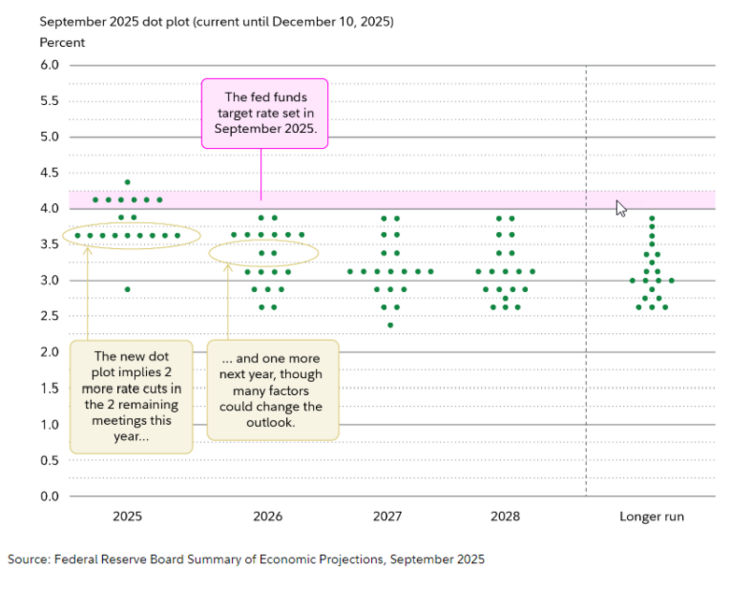
How to interpret the Fed's dot plot?
There are two points to keep in mind:
- Trends: The overall pattern shows the direction policymakers think interest may take in the coming years.
- Clusters: While some dots may stand out as outliers, the areas where dots cluster begins to show agreement among the policymakers.
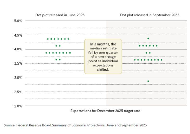
How does the Fed’s dot plot change?
The dot plot reflects the best guesses of the Fed’s policymakers about where interest rates will be in the future. These estimates naturally evolve as the target date gets closer and economic data grows clearer.
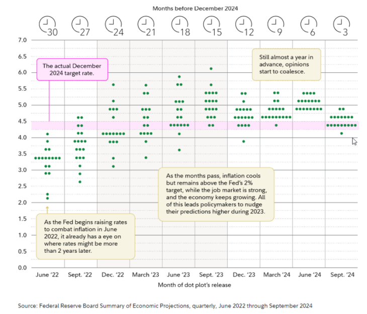
Here is an example showing how the dot plot for December 2024 evolved over the previous two years. The Fed started raising rates in March 2022 to fight inflation, while also forecasting where rates might stand by December 2024.
As you can see, expectations rose quickly before flattening out.
Why does the Fed’s dot plot change?
The Fed’s dot plot changes as policymakers adjust how high (or low) they think rates will need to be in order to keep inflation low and employment high.
They pay close attention to four major indicators:
- Change in real GDP growth: This shows how fast the economy is growing after accounting for inflation.
- Unemployment rate: Because one of the Fed’s mandates is to keep unemployment low. This number is also a key signal of the economy’s health.
- PCE inflation: The Personal Consumption Expenditures price index tracks how much prices are rising across the economy. Unlike the Consumer Price Index, which focuses on a basket of specific goods and services, the PCE looks at what people actually spend their page 7 money on and how their spending changes when prices rise. For example, CPI might tell us the price of steak is going up, but it does not show the effect of consumers switching to hamburger to cut their grocery bills. PCE, on the other hand, captures the change in how much people are actually spending.
- Core PCE inflation: This version of PCE leaves out food and energy prices because those prices can be so volatile. That helps the Fed see how entrenched inflation is in the rest of the economy.
So as part of the quarterly Summary of Economic Projections, Fed officials estimate where these four indicators will be over the next few years. If they move in unexpected ways, the Fed updates its outlook and that’s when you will see changes in the dot plot, which shows where officials think interest rates are headed.
Why the Fed’s dot plot is important
The market has always been sensitive to changes in the federal funds rate. But until 1997, these changes often came as a surprise. It wasn’t until August 1997 that the Fed acknowledged that it used a specific target for the federal funds rate as its main way to guide monetary policy. Since then, it has become more and more transparent about its policy targets and its considerations, so there are few big surprises to unsettle the market. Since 2012, the Fed has incorporated the dot plot as part of its efforts to increase transparency. As a result, markets now study it closely for signals and insights, meaning they are rarely caught off guard.
Información importante
La presente publicación ha sido elaborada por Mirabaud. No está destinada a ser distribuida, divulgada, publicada o utilizada en ninguna jurisdicción en la que dicha distribución, divulgación, publicación o uso esté prohibido. No está dirigida a personas o entidades a las que resulte ilegal enviar dicha publicación.
Leer más

Continuar con
